EventHub
Website & Mobile App
The simplest way to find events, experience new things, and connect with people - all in one place
Project Overview
EventHub is a Website and mobile application for finding events based on the user’s location, preferences, financial capacity, and availability, connecting people with similar interests through these events. Users can easily find and book their next favorite event. Plus, every booking earns points that can be used towards the next booking, making your experience even better.
In this case study, I will first introduce the mobile app and then demonstrate the main iterations made to the website.
Problem & Solution
Problem Statement
people are suffering from loneliness and are looking for social connections and also friends with similar interests.
people have busy schedules and are finding it difficult to attend events that they are interested in. This is leading to a sense of frustration and disappointment among people who feel like they are missing out on opportunities to attend an event.
people are suffering from finding a central platform that meets their needs and interest. They searching for a platform that allows them to easily discover and participate in events that align with their interests.
Due to financial pressures, some people may find it more difficult to afford tickets to events they would like to attend
Solution
EventHub enables people to find others with similar interests by using the user’s location and interests.
Users can receive notifications about upcoming and favorite events so they don't miss social gatherings and events.
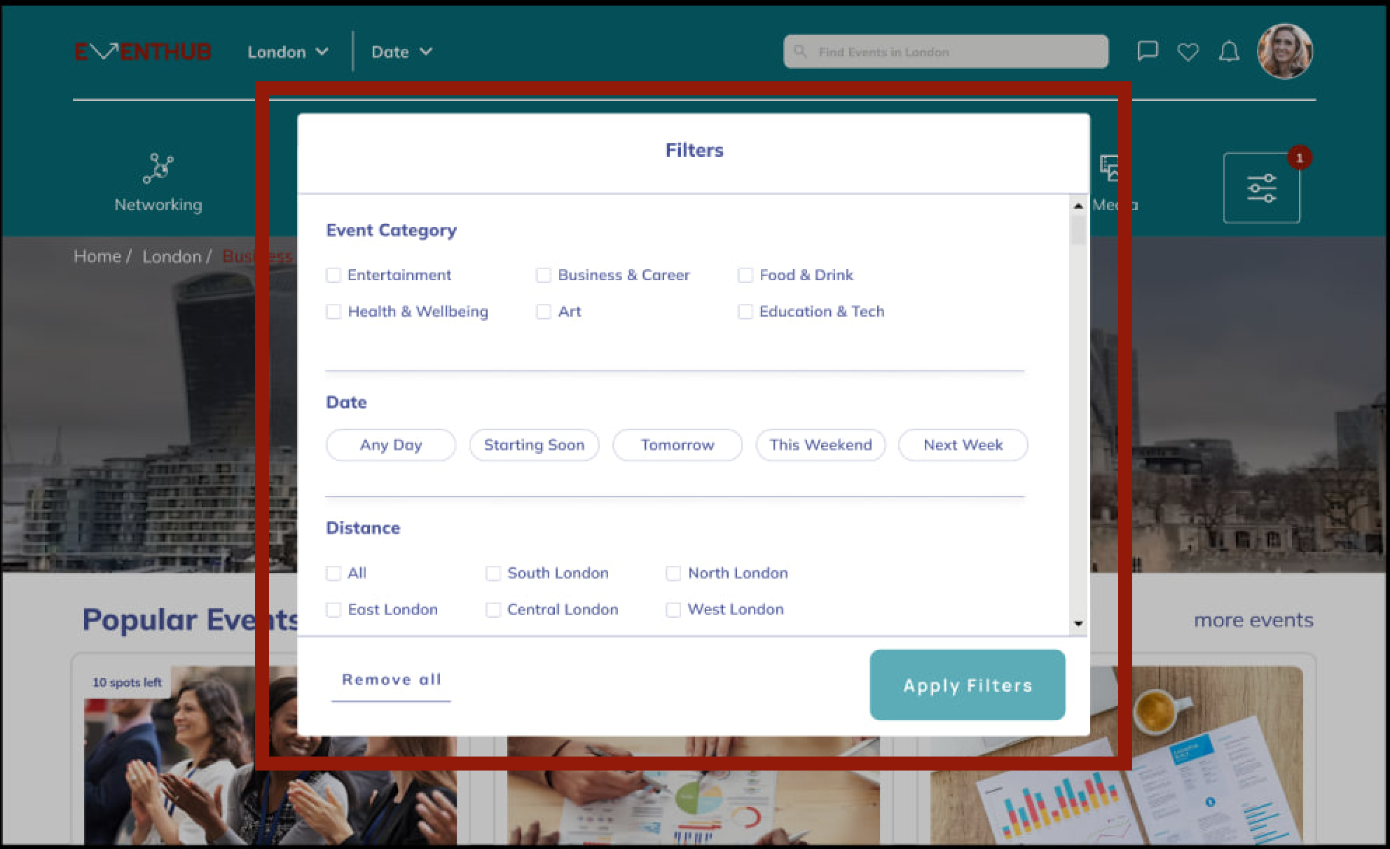
Users can search the events based on interest with the help of filters. The filters include category, date, distance & price.
Every booking earns points that can be used towards the next booking. Making attending events more affordable.
Design Process
User Research
User Interview
Affinity Mapping
Competitive Analysis
Scenario & Story board
Persona
Brain storming
Wireframes
Information Architecture
User Flow
Visual Design
Implementing Feedback
Usability Testing
Discovery Phase
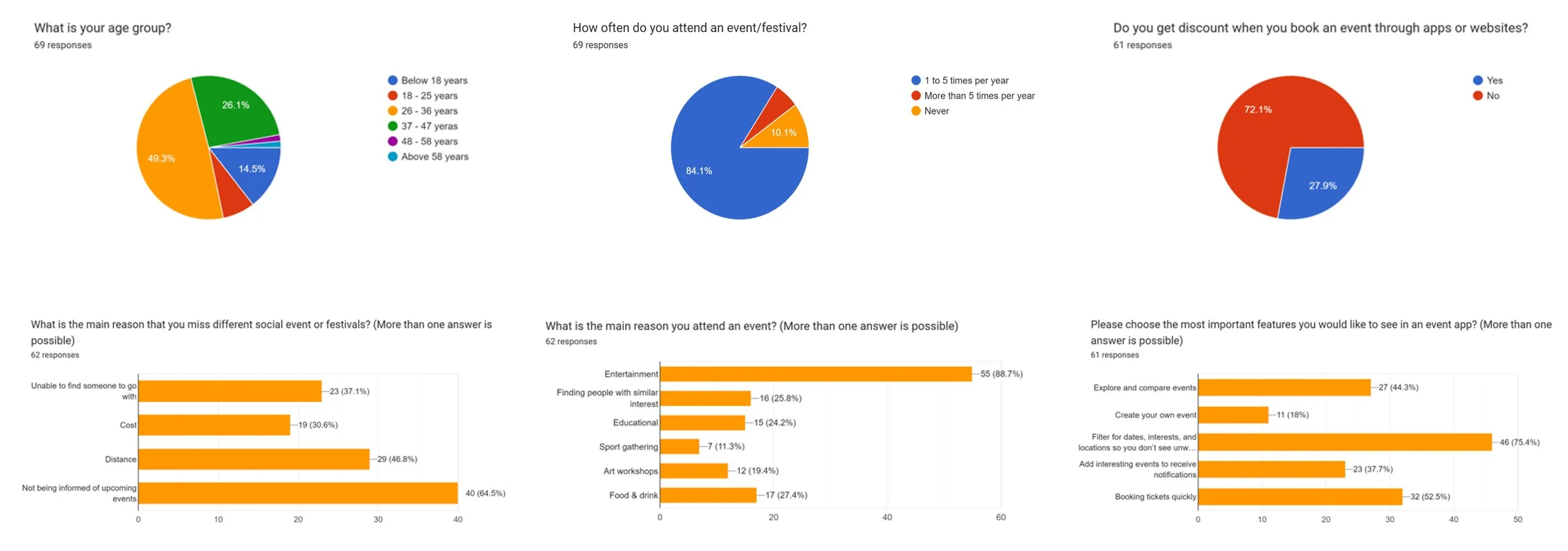
We surveyed 70 eventgoers with 14 questions to gain initial quantitative insights. We wanted to better explore the group of users we were designing for with the following research goals:
Quantitative Research
Find out what features they find or would find useful in an event app.
Determine user behavior at events and what frustrations or pain points they have around attending and planning for these events.
Understand users opinions of socializing with people with similar interest through events
Major Takeaways
The majority of users are in the age category of 25 to 45 years with an average income. They go to more than one event per year and love new experiences.
76% of the users claimed that being able to filter location, date, time, and distance is important to them. They also showed interest in viewing events on a map.
72% of users are willing to receive a discount.
65% of the users would like to receive notifications so they don’t miss out on their favorite events.
63% of users preferred to use the app.
56% of users would strongly prefer to connect to people with similar interests for networking.
We conducted 12 user interviews during the discovery phase to get a better understanding of users’ needs and concerns.
Qualitative Research
The majority of people think attending events help in socializing.
Most people want to be notified of new events and receive personalized recommendations.
Most users want to go to weekend events and prefer finding and meeting people with similar interests in person.
the importance of filtering options such as date, time, location, and distance for more personalized and efficient event discovery.
price is a significant factor for users when considering booking event tickets.
Major Takeaways
The purpose of this competitive analysis is to evaluate the in-app communication and chat features, filters, notifications, and loyalty discounts offered by popular web apps. To conduct this analysis, we reviewed several web apps and evaluated them based on a range of criteria, including participant chat, easy-to-access filters, available features, and user experience. The following chart SUMMARIZES our findings and highlights the strengths and weaknesses of each feature.
Competitive Analysis
Overall
Eventbrite is a comprehensive platform for a wide range of events.
Downtomeet is focused on local community events.
Fever is a highly visual and curated discovery platform.
Meetup is geared towards community-building.
Songkick and Bandsintown are both specialised music event platforms and offer personalised recommendations.
We have researched the market thoroughly and through this analysis we have discovered additional features to improve user experience.
We have added a point-based loyalty system to incentivise financial spending and membership to our website. Moreover, it has become easier than ever to chat to your fellow event goers with private and group chats being automatically set up when you book an event.
Define Phase
From the user research, a primary user persona was created. This would help ensure we were designing for real users throughout the process. Samantha is outgoing, tech-savvy, and loves to make new connections. She likes to fill her weekends with activities and events to help her unwind and meet new people.
User Persona
Samantha recently moved to London for a new job opportunity. It's her first time living alone in a new city, and she's feeling a bit overwhelmed by the change. She spends most of her weekdays at work, and although she enjoys her job, she finds herself feeling lonely during her free time.
User Scenario & Storyboard
With our persona and storyboard at the forefront of our minds, we developed user flows for 5 key tasks. These included signing up, personal information, using filters to find events and buying a ticket, and sending messages in participant discussions.
User Flow
Ideate Phase
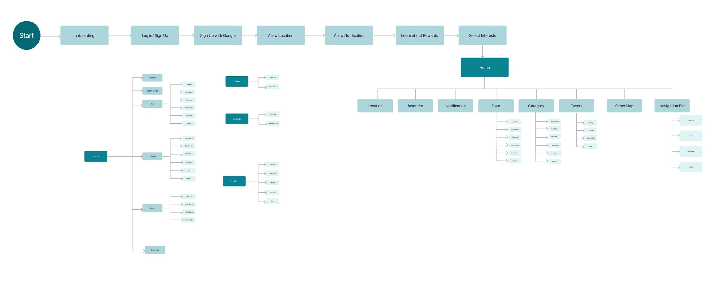
Next, we designed the sitemap that demonstrates how pages are ranked, connected, and labeled.
Information Architecture
Design Phase
After the ideate phase, we created the low-fidelity wireframes on paper roughly. It helps us to visualize and test early concepts, requirements, and design assumptions at the beginning.
Sketches
Design System
We developed a design system to promote consistency and structure throughout the project. During the process of selecting the main colors, we performed tests and iterations on the color choices to ensure that they work well in the overall design of the event app and meet the needs of the target audience.
Colours & Typography
Buttons & Bottom Bar Navigation
Button
Bottom Bar Navigation
Icons
UI Design
On boarding Screens
The onboarding screens clearly communicate the purpose and benefits of our event app. We tried to incorporate visually appealing elements such as images, icons, and illustrations that help users understand the app’s features and functionality.
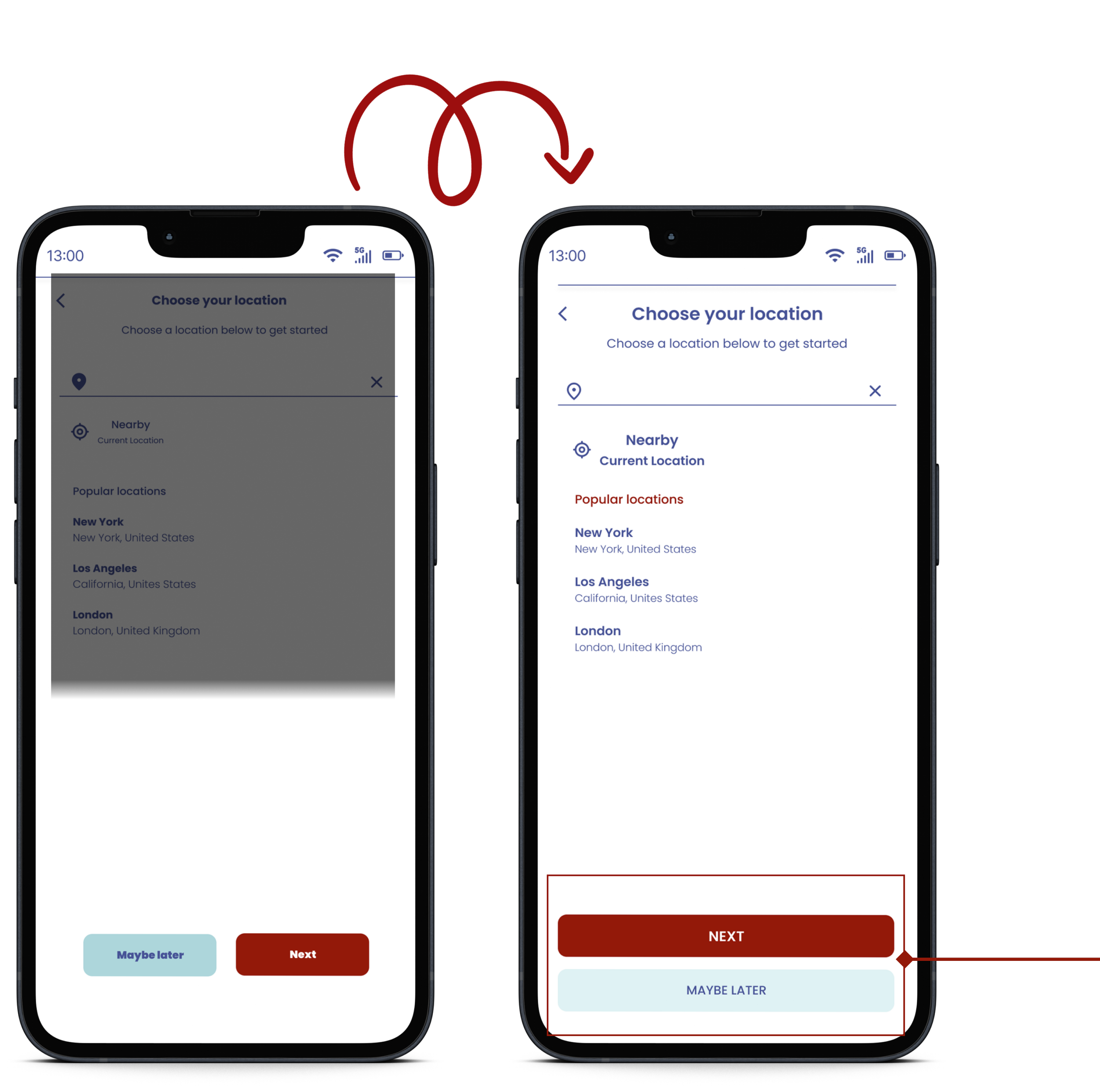
Location & Preference Screens
Users can customize the onboarding process based on their location and preferences to make it more relevant and engaging.
The home screen of our event app prioritizes personalized content and prominently displays key event information. Users have convenient access to location, notification settings, event categories, and dates directly from the home page. Additionally, we have incorporated a map feature that allows users to view events based on their geographic location. Throughout the design process, we have carefully considered the preferences and needs of our target audience to create a home screen that provides a seamless and user-friendly experience.
Home Screen
Search Screen
Filter Screens
The search screen in our event app enables users to effortlessly enter keywords to search for events or venues. Additionally, we have included filters for date, category, and sorting options that allow users to further refine their search results based on their preferences. This allows users to easily find events or venues that align with their specific interests or requirements.
Event Details Screen
The event detail page in our event app is designed to provide users with comprehensive information about the event. It includes event details along with a visually engaging image that creates a visual experience for users. The event page also includes information about the event organizer and participants, along with chat functionality that allows users to engage in discussions with other participants or organizers. To help users easily navigate to the event venue, the event page includes a map and directions. Furthermore, the event page may also feature recommendations for similar events that may be of interest to users. Lastly, the event page includes options for users to provide feedback or reviews about the event, helping to gather valuable insights and feedback for future event planning and improvement.
Payment Screen
The payment page in our event app clearly displays the total payment amount and keeps the process simple and straightforward with minimal steps. It provides users with payment options and offers confirmation of their payment status, along with a receipt of the transaction. Once the payment is completed, users should be able to view their tickets and have the option to navigate back to the home page or continue using the app.
Message Screen
The messaging page in our event app offers participants the flexibility to engage in both private messaging and group messaging, fostering communication and engagement among event attendees. Once participants have purchased their tickets, they can view a list of other participants and easily initiate private conversations or join group chats based on their interests. Furthermore, the app allows participants to create and manage their profiles, giving them the ability to personalize their experience. This includes the option to add a profile picture and set privacy preferences, allowing participants to control their visibility and manage their personal information according to their preferences.
Test Phase
Usability Tests
After developing a high-fidelity prototype, we conducted user testing with ten participants. Based on their feedback, we made several changes to the app.
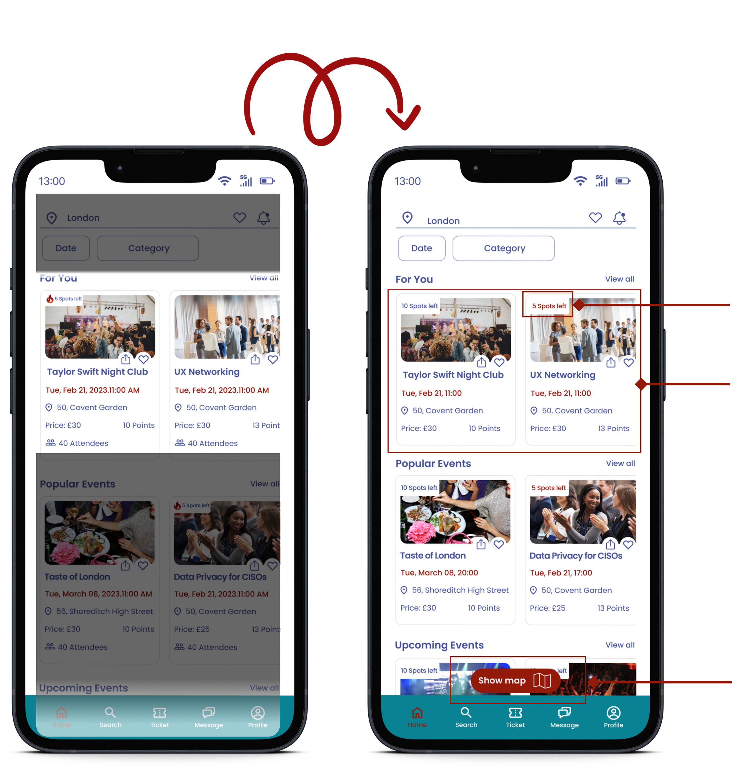
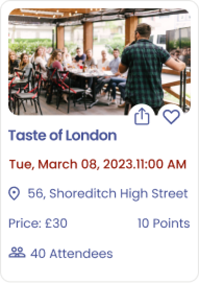
1. Feedback from usability tests indicated that users requested the inclusion of the number of available spots on the event cards.
2. Through multiple iterations, we revised the format of event cards to present the information more concisely.
3. We integrated a map on each page that enables users to view events based on their location.
Before
After
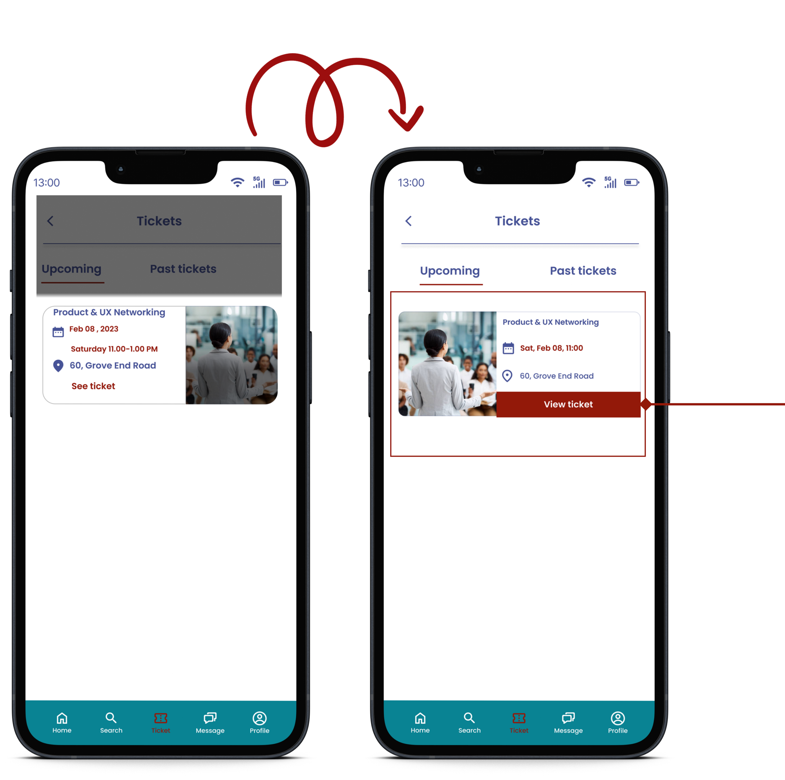
1. We modified the size and accessibility of call-to-action (CTA) buttons to enhance their usability.
1. We revamped the event detail page to be a more engaging and user-friendly experience.
1. We modified the size and accessibility of call-to-action (CTA) buttons to enhance their usability.
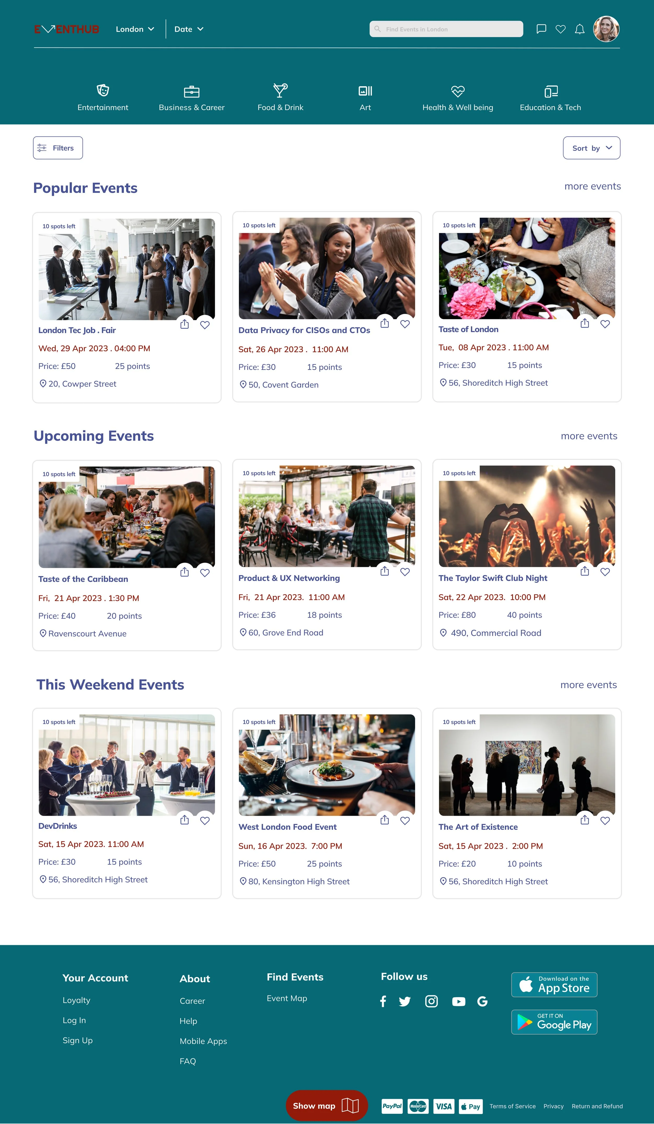
We endeavored to create a homepage that is both informative and engaging. To achieve this, we utilized high-quality, visually appealing images to elicit positive emotions from the viewer. Afterward, we solicited feedback from our audience, which we used to iterate and enhance the hero image and homepage content.
Website Design
Iteration
Hero Image & Navigation Bar Iteration
Before
After
We opted for a minimalist logo design and adjusted the spacing between items on the navigation bar. The search bar allows users to search for events based on their preferred location.
we discovered that users would find location and date filters to be the most useful. We subsequently made several iterations and decided to include them in the navigation bar.
Filters Iteration
Before
After
After conducting thorough research
We worked on developing a filter layout that is user-friendly and easy to understand.
Then, created filter options based on relevant categories and ensured that they were interactive.
Following several rounds of usability testing, we concluded that placing event categories above the hero image would be optimal. To enhance usability, we opted to combine text and iconography to introduce each category.
After testing the filters with a group of users, we gathered their feedback and used it to iterate and improve the design until we had a filter system that effectively helps visitors find the events they are interested in.
Business Page Iteration
Before
After
After conducting multiple rounds of usability testing, we discovered that placing business categories below the main navigation would result in a more user-friendly experience. Additionally, we made the decision to remove the hero image from the business page.
UI Design
Home page Screen
Filters Screen
Map Screen
Events Screen
Event Details Screen
Website Final Prototype
Reflections
What I have learned from this project?
The importance of early and multiple rounds of testing:
In my past projects, I lacked the necessary time and flexibility to conduct multiple rounds of usability testing. However, in this project, I made a deliberate effort to conduct extensive testing as early as possible in the process. By doing so, I was able to validate every design change and have the assurance that I was making informed decisions at each stage of the project
Confidence:
Throughout the project, I have developed a stronger sense of trust in my instincts and have become more confident in my design choices. I view this experience as a defining point in my career as a designer.
What can I do next?
I acknowledge that there is always room for improvement. Moving forward, my plan includes focusing on the following two main tasks to accomplish next:
To enhance the messaging section of the app, I propose incorporating the ability for users to edit or delete messages after sending them. Additionally, it would be beneficial to add support for emojis and stickers, enabling users to infuse a touch of personality and amusement into their messages.
My aim is to create a notification page that presents information in a clear and concise manner, facilitating users' ability to customize their notification preferences.


