SeeWalls
Responsive Classified Ads Web Design (Start-up Company)
Imagine you just moved to a new city in Canada. You’re searching for a rental property that fits your budget and lifestyle, but existing listing platforms feel outdated, cluttered, and frustrating to navigate. You spend hours scrolling through irrelevant properties, struggling to find exactly what you need. That’s where SeeWalls comes in.
SeeWalls is a classified ads start-up in Canada designed to simplify the property search experience. Focusing on Diverse Services and Real Estate, our platform helps users connect with the right listings through an intuitive, user-friendly experience.
Our platform, built from the ground up, offers smart filters, personalized recommendations, and a seamless interface, making property discovery effortless and stress-free.
Crafting a straightforward and minimalist layout.
Combining colors from Persian and Canadian palettes.
Real estate & services need to be discoverable in different categories
Make a wanted form for those who look for a specific need
Stakeholder needs
Homepage & filters needs
Introduction
Our real estate platform now offers user-friendly filters for seamless navigation.
The search bar is now more usable, and users can search by location and keywords.
We also provide explanations of various services and real estate offerings,
as well as introduce our mobile app for the future and post ad section to users.
Project Overview
My role: Conducting user research, performing competitive analysis, doing the entire product design process, visual design, and conducting usability testing.
The UX/UI design team for this project consisted of seven designers, with two of us specifically focusing on the real estate section of the website.
Our initial focus was on understanding the project thoroughly. We engaged in stakeholder meetings to grasp the core problem. Following this, we conducted user interviews and usability tests to uncover pain points. Additionally, we analyzed eight similar websites to identify strengths and weaknesses.
Understanding Project & Users
In the second step, we interviewed several users to understand their needs and pain points in finding properties. We also conducted usability testing on similar websites.
User Interview
We carried out a competitive analysis to understand the diverse functionalities and operational approaches of various classified ad websites. This involved examining different sections of these websites, including consistency, various filters, user interface, and more.
Competitive Analysis
We constructed a strength and weakness model from competitor websites to identify opportunities for improvement and potential threats in the functionality of our platform.
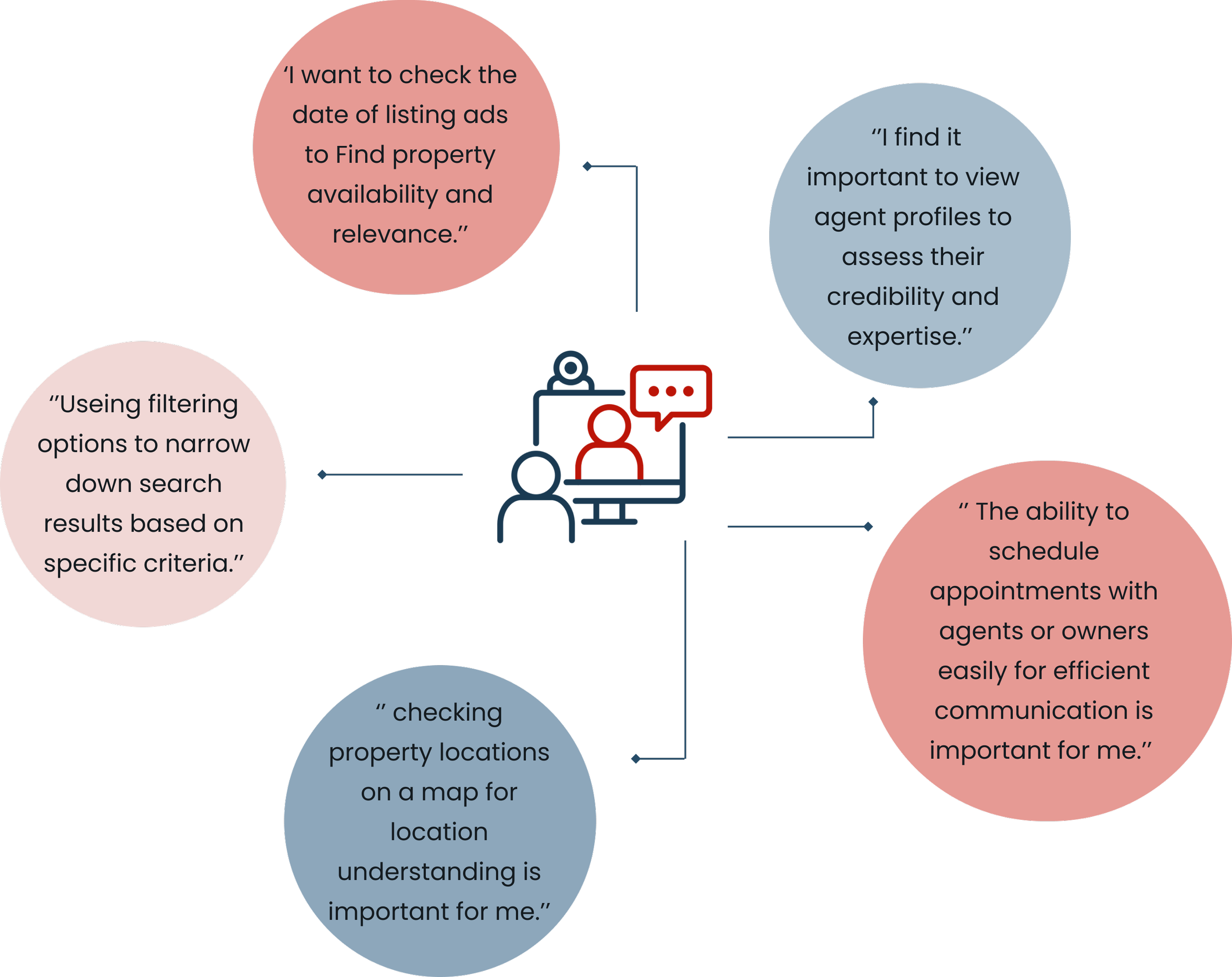
Easy searching by choosing location and keywords.
Doing precise filtering to easily access related ads.
Showing the posting ad date.
Showing reviews and ratings of providers to enhance trustworthiness.
Direct communication between provider and users.
Detailed property listing and map view.
Major research takeaways
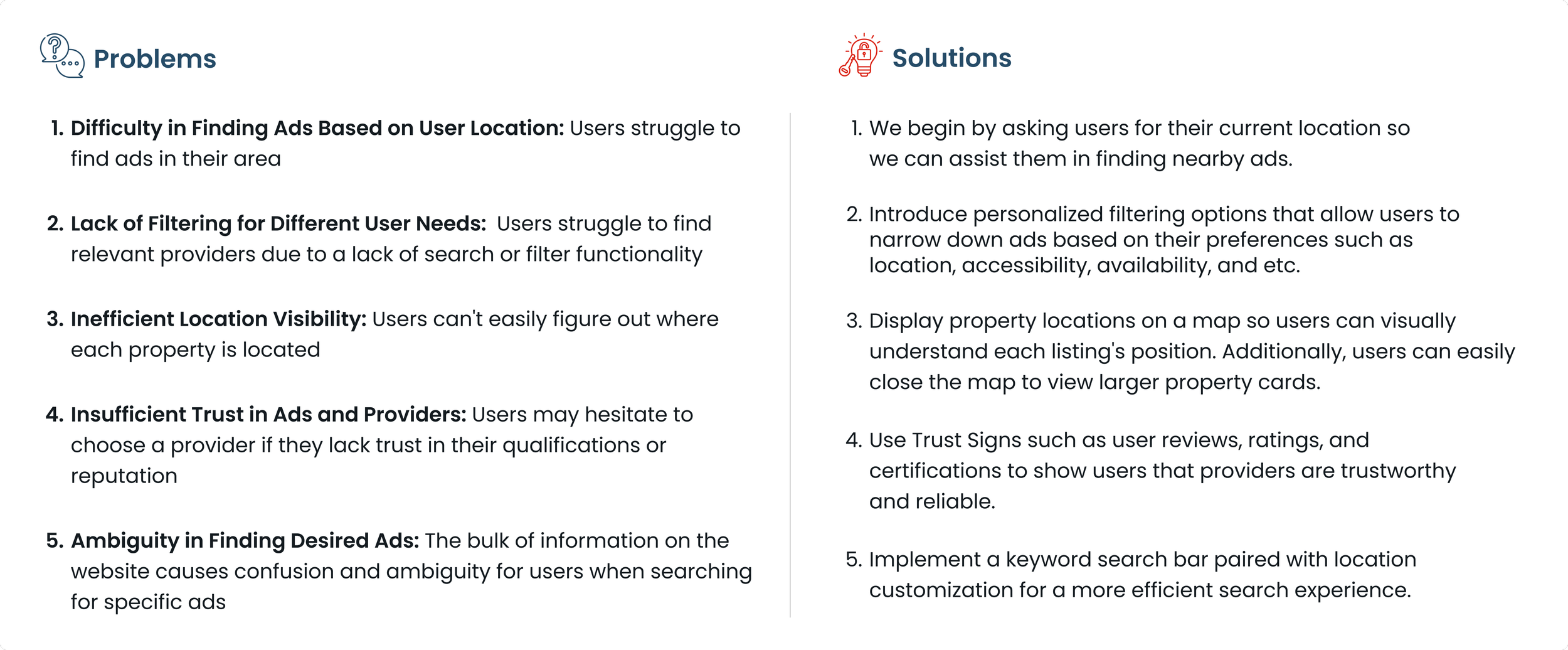
Problem Statement
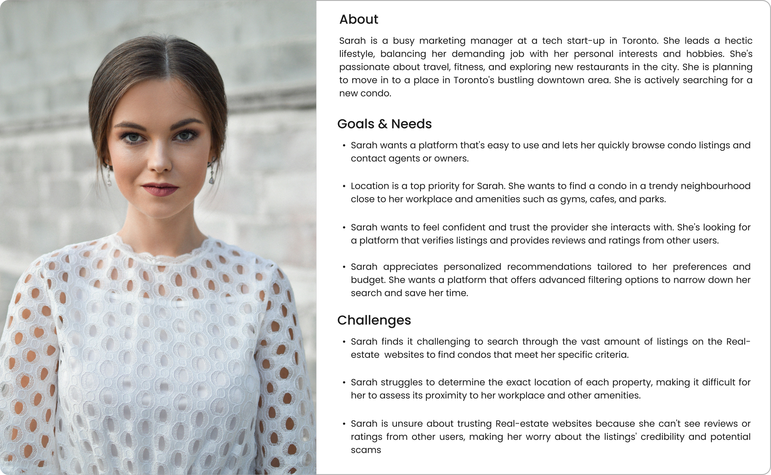
Persona
The user flow was crafted based on the process of renting an apartment in a specific location, tailored to accommodate user preferences through effective filtering.
Creating a site map is essential for organizing content effectively, guiding users intuitively, and optimizing usability. It visually represents the website's structure, ensuring a seamless user experience and helping identify content gaps or redundancies.
We created a visual representation of Website screens at a low-fidelity level. The primary purpose of wireframing was to outline the layout, structure, and functionality of a digital product before diving into high-fidelity design and development
Wireframing
In our design meetings, which involved the UX team, stakeholders, and developers, we collaborated to identify challenges, brainstorm solutions, and gather feedback. Together, we reviewed progress, clarified requirements, and made decisions, ensuring alignment and progress towards our shared objectives.
Teamwork
UI Kit
The mood board was inspired by a combination of Persian blue and Canadian red.
In order to ensure alignment with project objectives, we provide a comprehensive explanation for each design decision made.
High fidelity wireframing
Home page
Search bar, to allow users to search for specific service or property items quickly.
Adding the location to the navigation bar makes it easier for users to find properties in specific locations. This helps users quickly navigate to listings in their desired locations, making the website easier to use and more satisfying for them.
Placing the Post Free Ad button in both the navigation bar and the landing page ensures that providers can easily post an ad. This approach enhances accessibility and visibility, making it effortless for providers to initiate the ad posting process from anywhere on the website.
The reason for putting the Value Proposition on the landing page is to quickly communicate the unique benefits and offerings of the platform to visitors. This helps users understand the value of using SeeWall right away, increasing their engagement and likelihood of exploring further.
Search page
Property filters such as number of bedrooms, size, pet-friendliness, and more serve as valuable tools for users to filter their search criteria and find properties that align with their specific preferences and requirements. Moreover, filter results are displayed above the listing ads, providing users with convenient access and the flexibility to easily modify or remove filters as needed.
The sticky search bar in the navigation makes it easy for users to access search functionality from any page on the website. Additionally, it allows users to change the location at any time, enhancing their browsing experience.
The property ad card shows important details at a glance, like when the ad was posted, when it's available, and who listed it, whether it's the owner or an agent.
Breadcrumb shows the user's current location within the web app structure.
Search page with map
The map button allows users to easily toggle between viewing listings with and without a map. This feature enables users to visualize the exact location of each property, providing valuable context and aiding in their decision-making process.
Horizontal property card, We faced an issue trying to use vertical property cards on the map page. The grid layout didn't work well with these cards, so we decided to create horizontal cards instead to fit better with the grid and keep the design consistent.
Property description page
The provider's rating system enhances user trust and aids in selecting reputable providers. Users can make more informed decisions by evaluating providers based on their ratings, fostering a sense of confidence and reliability in the platform.
Usability Testing
Usability testing is crucial in ensuring that our design meets the needs and expectations of users. By observing real users engaging with the service, we gather invaluable feedback to enhance the overall user experience.
We selected a diverse group of participants who have some familiarity with real estate websites.
Develop task that require participants to use the filter section to find specific types of properties or apply various filters.
Ask them to perform the task while thinking loud, sharing their thoughts, and providing feedback as they navigate the filter section.
Based on the insights gained from the usability testing, we made necessary adjustments to the filter section to enhance usability and address user concerns.
Iteration process in filtering section
In the first version of the filter design, the filtering options were arranged horizontally across the top of the page. The primary filters, such as location, price, and property type, were prominently displayed, while additional filters such as bedroom, bathroom, size, and more were grouped together in a separate section labeled "More Filters."
We improved the filter design in the second iteration based on users feedbacks and usability testing. Transitioning to a vertical layout and expanding filtering options enhanced the user experience by providing easier access to all filters.
In the third version, we changed to accordion filters. Accordion filters offer a streamlined browsing experience by allowing users to expand and collapse sections as needed. They save screen space while promoting user engagement through quick navigation of filtering options.
In the final version, we prioritized user needs by sorting filters based on their importance, ensuring that essential criteria like location were easily accessible. Additionally, users to effortlessly switch between offering and wanted ads, enhancing the browsing experience.
Iteration process in ad card
In the first version of the card, we created a sketch based on competitive analysis.
In the second version, we improved the card based on the user’s feedback and usability testing.
In the last version, we moved the dates to the top and added a "Listed by" at the bottom. Also, to enhance clarity in the image we brought the "Like" and "Share" options down to give more attention to dates and availability.
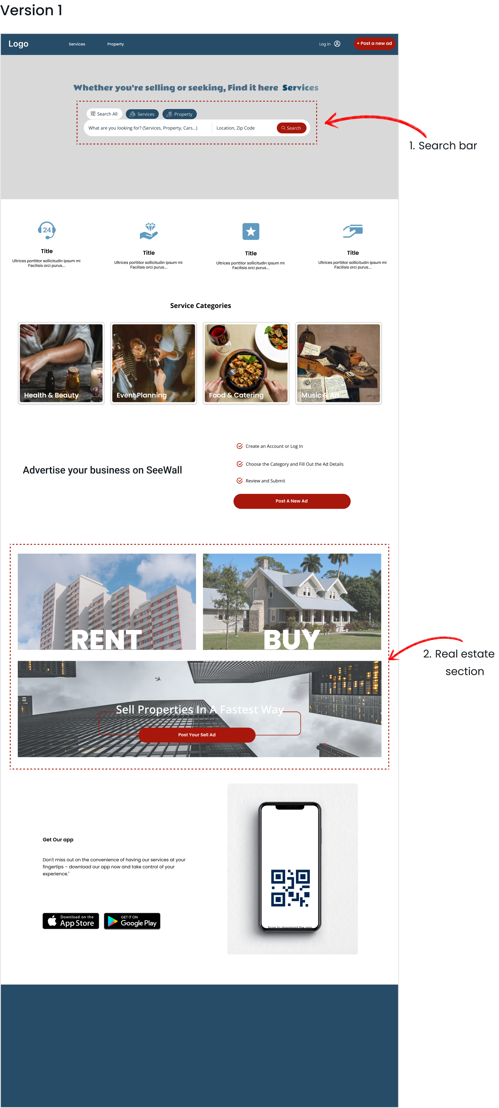
Iteration process in home page
Search bar: Creating a search bar for a website with various services, ensuring it's user-friendly, was tricky. We crafted a solution inspired by our research: a dynamic search bar with tabs for different services and real estate. Users can easily switch between tabs and use specific filters for each service, making searching simpler and more organized.
Real estate section: We focused on the visibility of the real estate section on the home page and observed user interactions to assess the ease of finding and navigating to other sections like sales, rentals, and posting ads.
Search bar: Through usability testing, we discovered that users found the search bar complex and preferred a simpler alternative. As a result, we revamped the search functionality to prioritize keyword searches. Now, users can easily find what they need by entering a simple keyword and enhancing user experience.
Real estate section: Usability testing revealed that users found the section's structure and usability understandable. However, we enhanced the UI design by implementing a bento grid layout for improved accessibility.
In the final version, our focus shifted towards refining the interface design to ensure a minimalistic and user-friendly experience. To highlight the importance of the search bar, we replaced the hero image with a prominent search bar against a white background. Additionally, we revamped the real estate section to enhance user understanding and guide them to the most frequently accessed pages.
Final Design (Desktop & Mobile)
What I learned:
Being on the team taught me the importance of staying in touch throughout a project's early stages, especially in working with developers and stakeholders. As a UI/UX designer, I've learned that continuous improvement through iterations is key, and I've become skilled at adapting to changes and meeting client needs as they evolve
What I do next:
I'll apply these learnings to enhance team dynamics and ensure alignment with stakeholders, developers, and user needs. I'll prioritize consistency across design elements and explore innovative approaches. Additionally, I look forward to designing the app and conducting extensive usability testing for continuous improvement.


